Two brands can order the same kraft tube and end up with packaging that looks a decade apart in quality, entirely because of how the graphics were applied. The cylinder shape changes the rules: a method that produces crisp results on a flat carton can crack at a seam or wash out around a curve. Choosing the decoration approach is really three linked decisions, how the artwork gets onto the tube, how many colors and how much detail it carries, and which finishes survive the forming process. This guide compares the common methods so you can specify the one that matches your artwork, your run size, and your budget.
Three ways the graphics get onto a tube
Almost every printed tube uses one of three routes. The premium standard is a litho-laminated wrap, where the artwork is offset-printed on a flat sheet of paper, laminated, and then wrapped around the tube body during forming. Because the printing happens flat, before the paper ever curves, it delivers the finest detail, clean typography, and reliable Pantone matching, which is why it dominates cosmetics and spirits packaging. The tradeoff is prepress discipline and setup cost, so it rewards larger runs.
The second route is direct printing onto the formed tube, which covers screen printing, flexo, and digital. Screen printing lays down thick, punchy ink and gives excellent contrast for a bold one- or two-color logo, but its color range is limited and registration gets tricky near the glue seam. Flexo is built for fast, repeatable, high-volume runs, with detail that depends on the plates. Digital printing skips plates entirely, which makes it the short-run and multi-SKU choice, though color consistency across batches leans on good file profiles. The third route is the simplest: an applied pressure-sensitive label wrapped onto a blank tube, which carries almost no setup cost and suits the smallest runs, at the cost of a visible label edge rather than an edge-to-edge printed surface.
Match the method to run size and color
The single biggest driver of which method makes sense is how many tubes you are ordering. Setup-heavy methods like litho lamination and flexo spread their plate and makeready costs over the run, so they only get economical at volume, while digital and labels start cheaply and stay flexible.
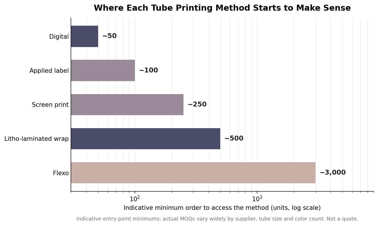
Read those figures as directional, not fixed, because real minimums swing with tube diameter, color count, and the supplier’s equipment. The pattern holds regardless: if you are testing a launch with a few hundred units across several SKUs, digital or labels keep you nimble; if you are reordering a stable design in the thousands, a litho-laminated wrap or flexo run lowers your per-unit cost and sharpens the result. Color count matters alongside quantity. A one- or two-color mark is a natural fit for screen printing, while full-color illustration, gradients, and precise brand colors point toward offset litho.
Finishes that survive a curve
Finishes are where tubes earn their shelf presence, but the cylinder imposes limits. Hot foil stamping produces a metallic shine that reads as premium even on a curved face, and it is a staple of luxury cosmetics and fragrance tubes. Its weakness is fragility at the edges: foil can crack near the glue seam or the tube ends, so the artwork has to keep foil elements away from those zones. Spot UV adds a glossy accent to selected areas, and because its effect comes from reflection rather than physical depth, it performs consistently on tubes, which makes it a dependable way to make a logo pop against a matte background. Full-surface matte or gloss lamination is applied as the wrap is formed; matte reads soft and elegant, gloss pushes color contrast and brightness. And specialty stocks, such as kraft, textured, metallic, or pearl papers, build their character into the material itself with no post-processing, which is often the cleanest look for sustainable and handmade brands.
Why embossing stays subtle on tubes
Embossing and debossing translate poorly from flat cartons to tubes, and it helps to understand why before you specify it. The printed sheet wrapped onto a tube is thin, on the order of 157 gsm, and it has to bend around the tube during forming.
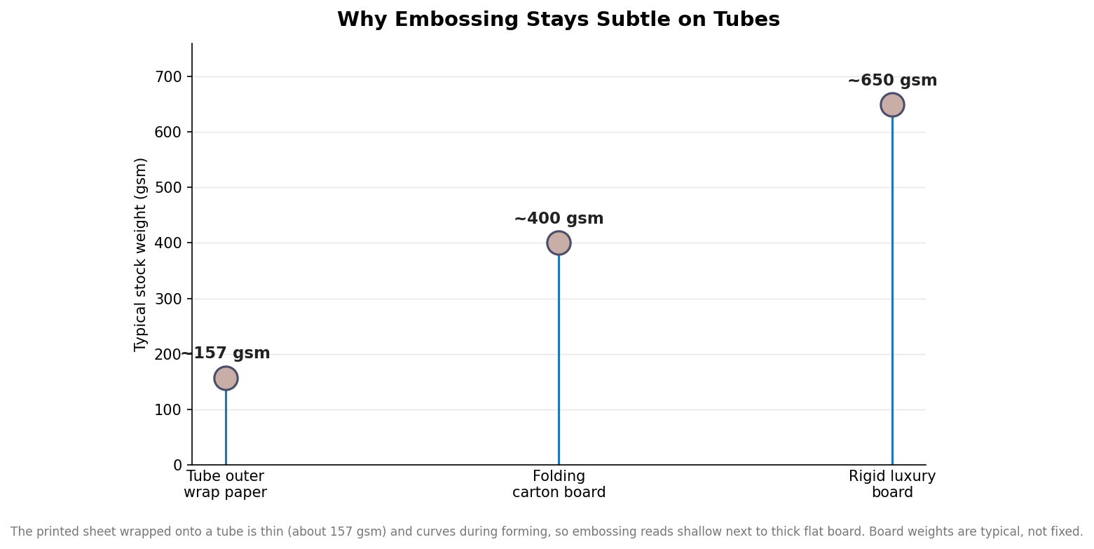
On a thick rigid carton, an emboss has enough material depth to cast a real shadow. On the thin wrap over a hard tube core, the same tooling produces a shallow, understated impression that many buyers find weaker than they expected. That is not a defect, it is physics, so treat embossing on tubes as a quiet tactile accent rather than a dramatic three-dimensional effect, and lean on foil or spot UV when you need the decoration to carry across the shelf.
Specify decoration without surprises
Most disappointments come from ignoring the seam. Every tube has a glue line where the wrap or the printed sheet meets itself, and foil, heavy solids, and critical logos all misbehave if they land on it, so tell your supplier where the seam should fall relative to your key artwork. Ask for the manufacturer’s template so your design accounts for the wrap and the caps, request a physical proof on the actual stock before a full run, and confirm the color build, whether CMYK process or named Pantone spot colors, matches the method you chose. Get those three things right, the seam placement, the proof, and the color spec, and the tube that ships looks like the one you designed rather than a rougher cousin of it.